
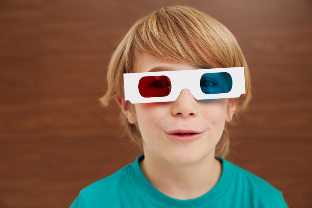
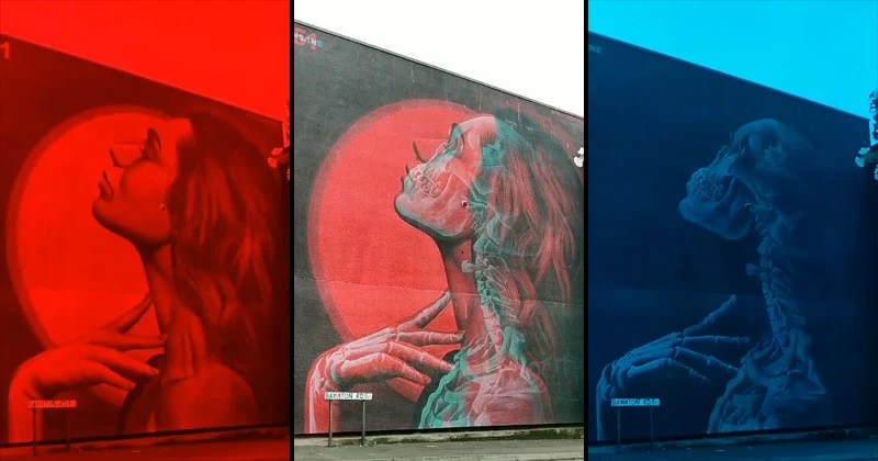
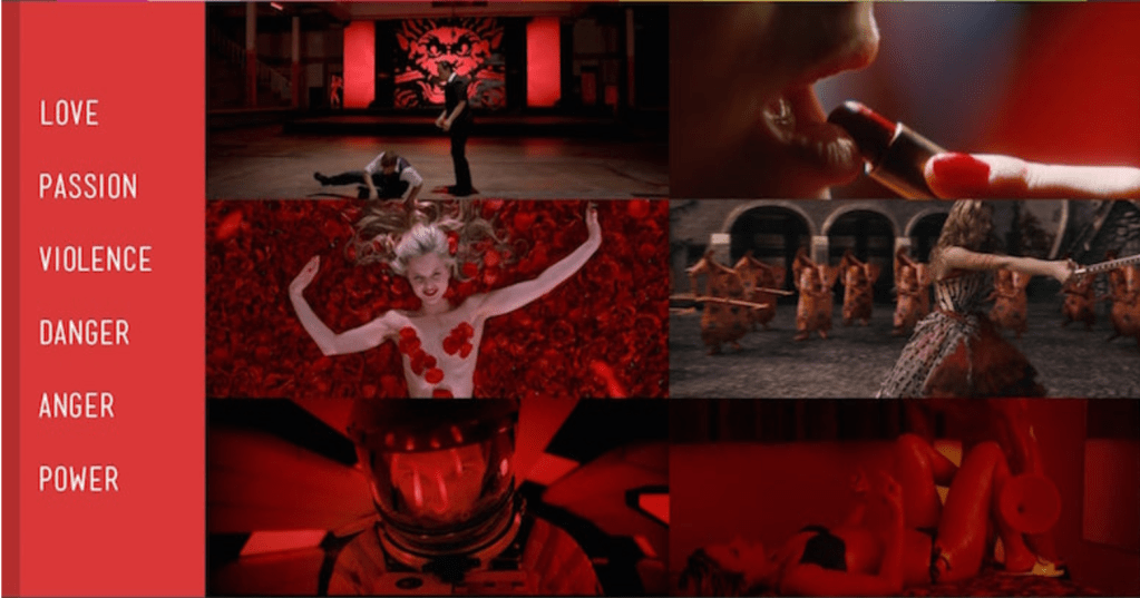
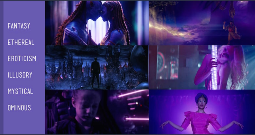
Whenever you hear the word Red vs Blue, your mind automatically comes to conclusion that it must refer to a conflict. I think it is more than that. Red and Blue are the two most common colours of the spectrum. As being complementary colours, together they create a sense of harmony. Lets take a look through the eyes of a colour spectrum e.g. red is often associated with strong emotions like power, passion and energy, using too much can overwhelm the space. Blue on the other hand calls to mind feelings of calmness or serenity. It is often described as peaceful, tranquil, secure, and orderly. Blue is often seen as a sign of stability and reliability. Businesses that want to project an image of security often utilize blue in their advertising and marketing efforts. This is not limited to nature but the concept of Red vs. Blue bouncing of each other dates as back as to the first 3d films ever made i.e. anaglyph 3d. The two complementary colours when inter-twined toghther created mind boggling imagery.
A fews of the examples are;


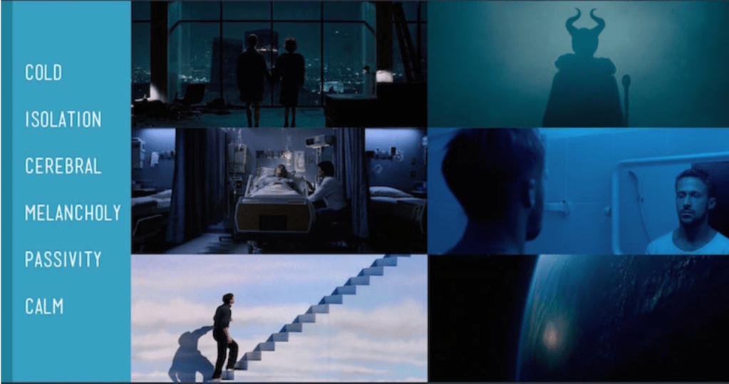
If you’re looking for a subtle way to make a scene resonate emotionally, there may be no better way than choosing a color associated with the emotion you are trying to evoke. e.g.
The assignment is very self explanatory ‘Red vs. Blue’. In this 2 week long assignment we are supposed to come up with ideas that fit the ideology of Red vs. Blue. In the next couple of blogs I will cover my research work, concepts, ideations, storyboards and animatics.
References
Insane51, 2020. Anaglyph Street Art. [Art].
Anon., n.d. Digital Synopsis. [Online]
Available at: https://digitalsynopsis.com/design/film-movies-color-psychology/
