Concept arts
As in the brief it was Red vs Blue, so those are supposed to be the dominating colours. But, this did not meant that there couldn’t be other colours as well. For this animation I am going for an old school vibe. A mixture of Max fliecher and Chuck Jones cartoons where the backgorunds were flat yet the charcters had a gradient feel.
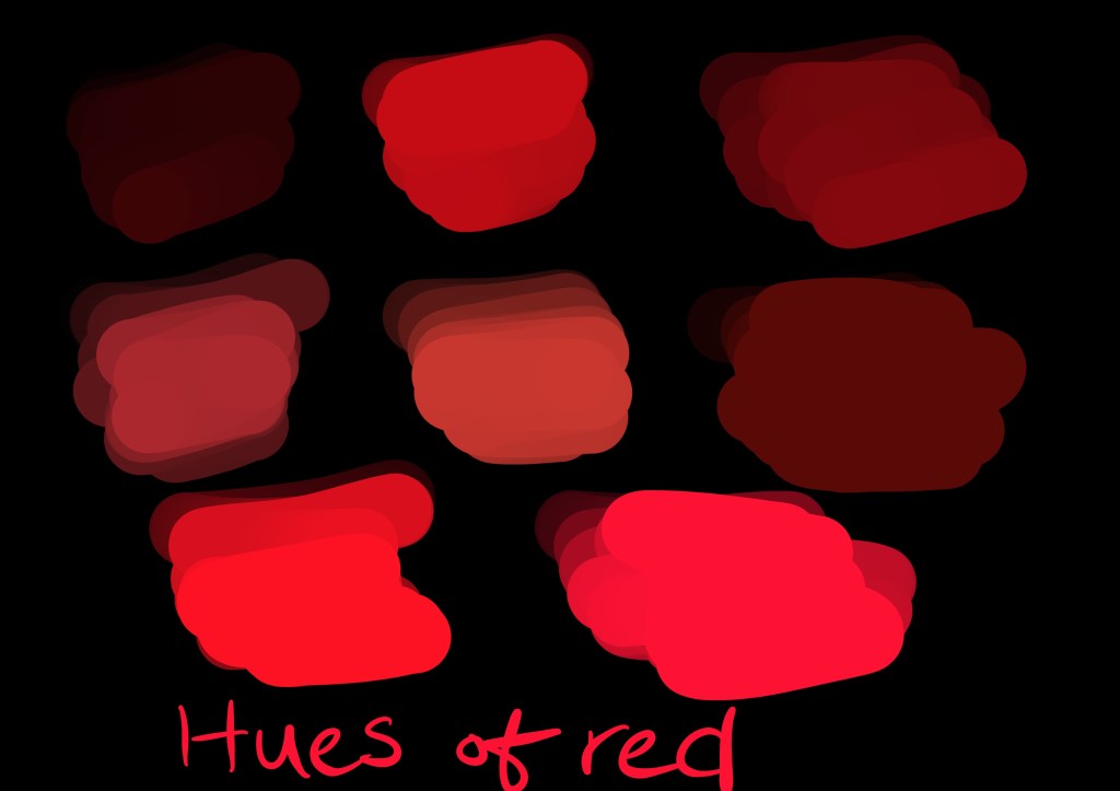
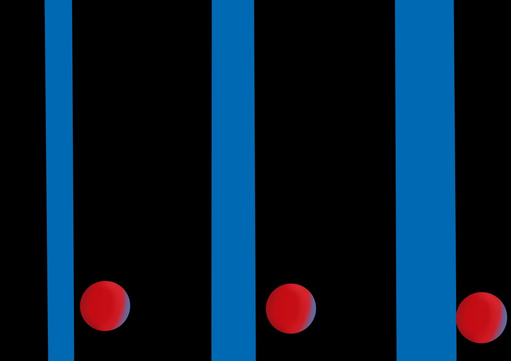
The character of Dot – Since I was to go for either red or blue, I did some ideation in both colours for the dot and line. This was necessary as the chosen colours needed to jusitfy the characters and have reason for them to be in those specific colours (have a purpose).
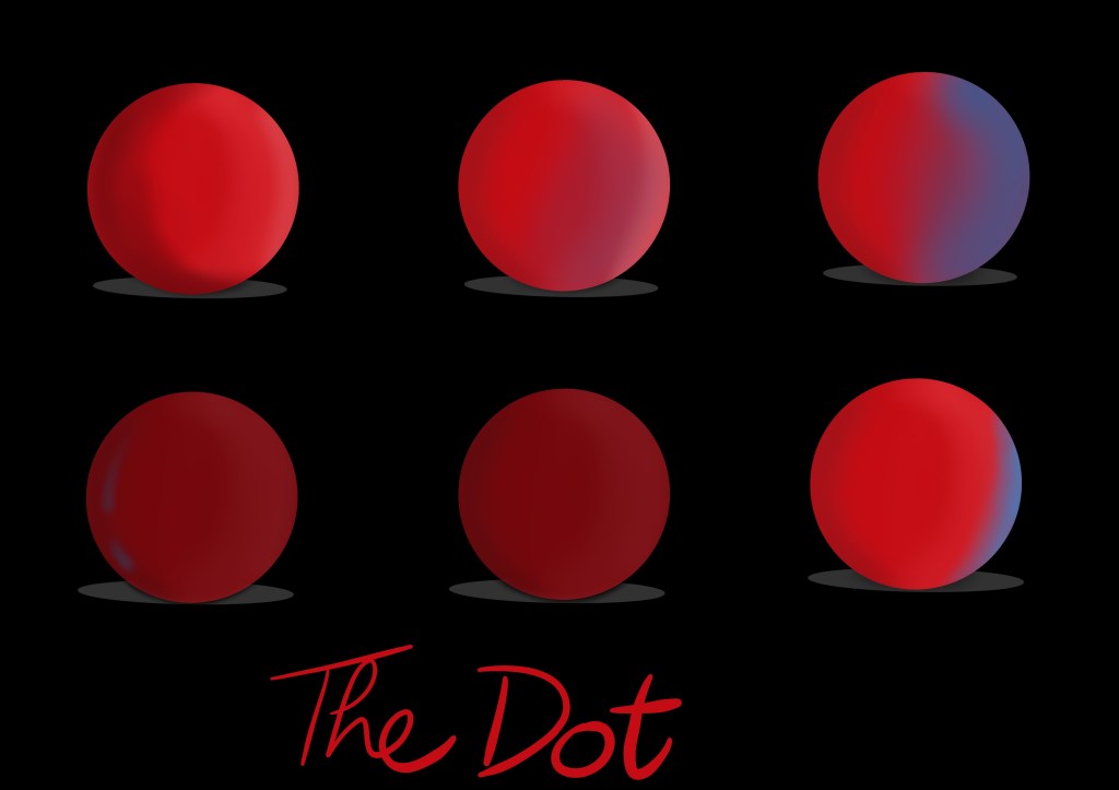
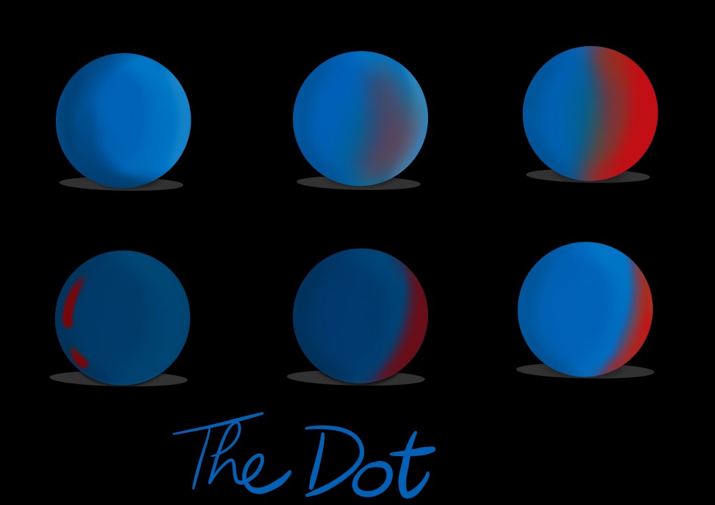
I think the colour red better suits the dot as it gives it more of characters. Gives it a warm feel while the blue colour feels a bit more energetic and accordinng to the story is better suited for the line.

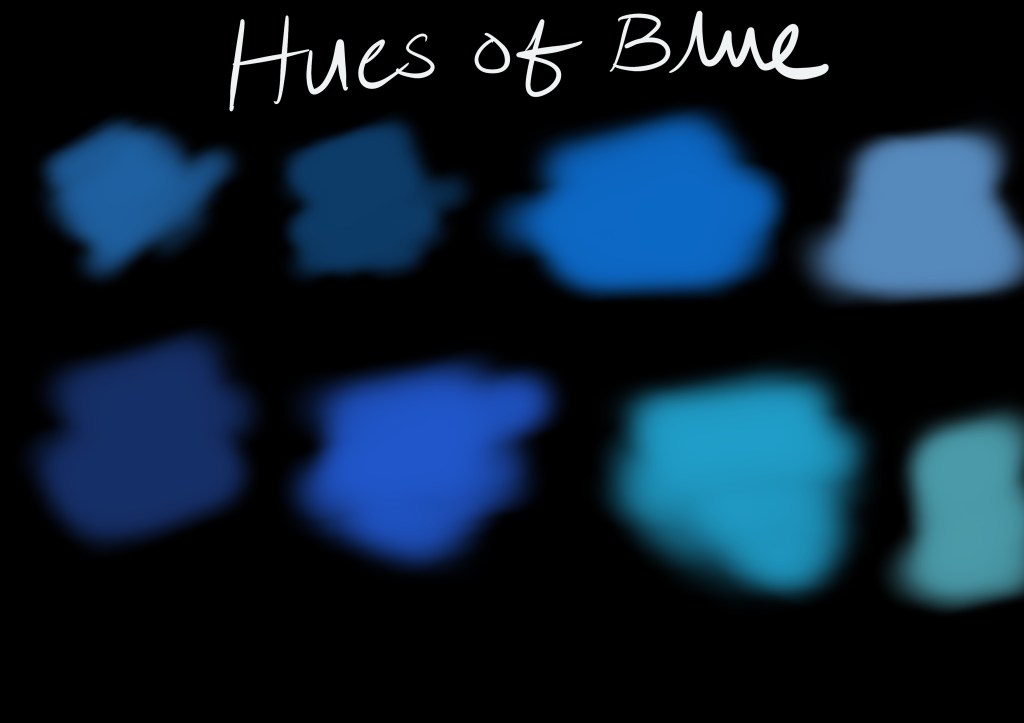
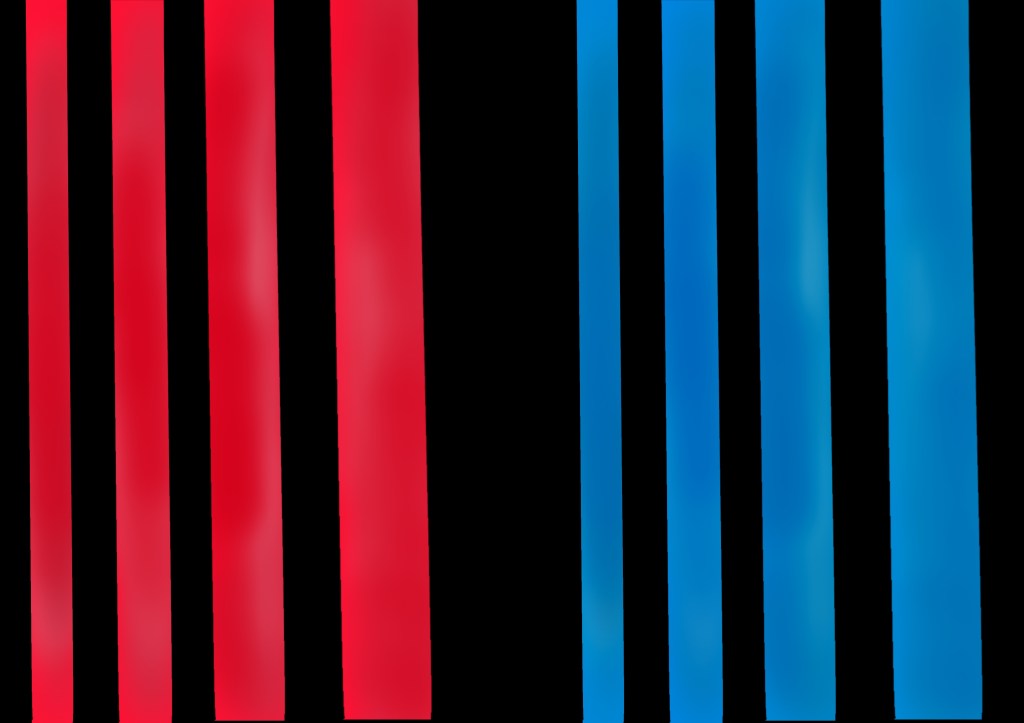
In order for me to fully decide on what colours to choose, a side by side comparison was necessary of the both characters. Consider it a suit test for the camera, just like in films.
With all done and dusted I will move on to the next phase, where I will try to work on the background.
