Forefront#7 | Imagination Unleashed: Drawing Parallels between “Junior Junction” and “Marcel the Shell with Shoes On”

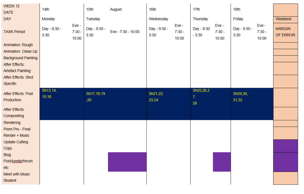
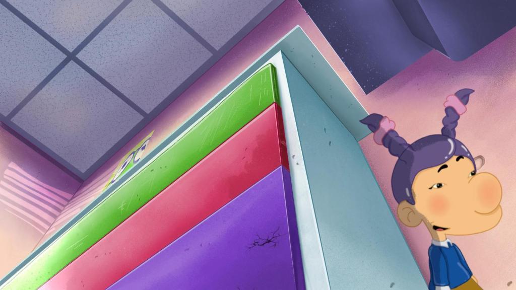
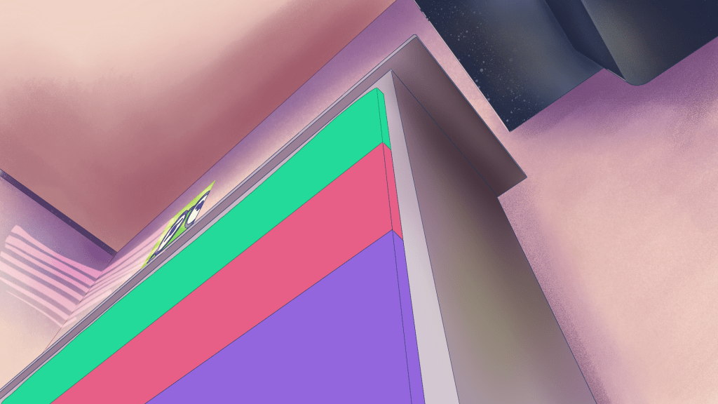
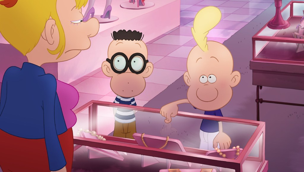
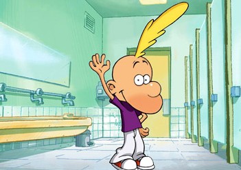
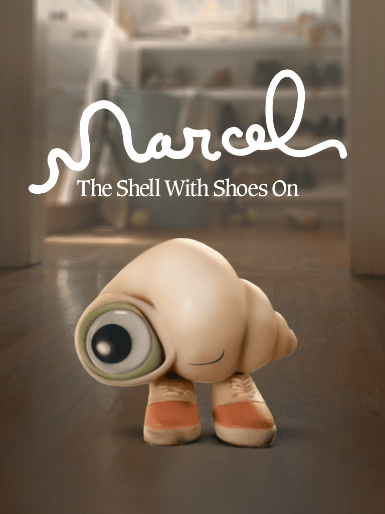
As an animator currently in the process of working on his MA thesis, I find myself immersed in the world of animation, seeking inspiration from various sources to infuse my creative flair into the project. I recently stumbled upon a short film that holds lives rent free in the heart of imaginative storytelling just like “The Little Prince” is “Marcel the Shell with Shoes On” (2021) by Dean Fleischer-Camp. This enchanting animated mockumentary has captivated audiences with its unique approach to storytelling and has uncanny resemblances to my own work, “Junior Junction.” Let’s delve into the world of Marcel and explore how it relates to my ambitious project (not to oversell it) (Camp et al., 2022).

  1. The Power of Imagination:

Both “Junior Junction” and “Marcel the Shell with Shoes On” celebrate the power of a child’s imagination. In “Marcel,” we witness the charming tale of a tiny shell with shoes, who narrates his fascinating adventures with an endearing sense of wonder. Similarly, in “Junior Junction,” the six-year-old students’ imaginations transport them into incredible scenarios within their classroom. The parallel here lies in the ability of children to see the extraordinary in the ordinary, creating enchanting stories from seemingly mundane settings (Anon, 2022).

2. Mockumentary Style:

“Marcel the Shell with Shoes On” is uniquely presented as a mockumentary, with Marcel himself narrating his life story, complete with interviews and clever anecdotes. This style adds a delightful layer of authenticity to the narrative. In “Junior Junction,” the children take on the roles of documentary filmmakers, chronicling their adventures and escapades within their imaginative world. Both animations blend reality with whimsy, inviting the audience to step into a child’s perspective and view the world through their eyes.

3. Embracing Imperfections:

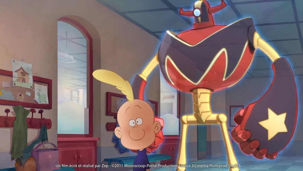
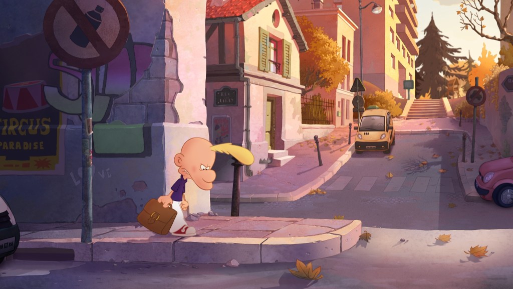
One of the endearing aspects of “Marcel the Shell with Shoes On” is its purposely “poorly executed” stop-motion animation. The film showcases Marcel’s world using simple, handmade techniques, giving it a distinct charm. Likewise, in “Junior Junction,” I’ve chosen to incorporate “poorly executed CGI” to enhance the children’s imagination. This intentional decision adds authenticity to the storytelling and reminds the audience of the pure and innocent creativity that only a child’s mind can conjure (Anon, 2022).

4. Quirky Characters:

Marcel, the adorable protagonist of “Marcel the Shell with Shoes On,” has won the hearts of many with his quirky personality and unique perspective on life. In “Junior Junction,” the six-year-old students bring their own distinct personalities and quirks to the forefront, making each character endearing and relatable. Both animations demonstrate the beauty of embracing individuality and the joy of celebrating uniqueness in storytelling.

5. Unpredictable Narratives:

In both “Marcel the Shell with Shoes On” and “Junior Junction,” the narratives take unexpected twists and turns. The imaginative scenarios created by the characters lead to moments of hilarity, wonder, and surprise. The element of unpredictability keeps the audience engaged and eager to explore what imaginative escapade comes next.

Conclusion:

As I embark on a journey to create “Junior Junction,” drawing inspiration from “Marcel the Shell with Shoes On” can prove to be a valuable asset. Both animations emphasize the boundless creativity of children, reminding us of the beauty of seeing the world through youthful eyes. By embracing the mockumentary style, celebrating imperfections, and crafting quirky characters, my animation has the potential to become a delightful and enchanting experience for viewers of all ages.

As I infuse my so so unique vision and storytelling into “Junior Junction,” may the magic of imagination continue to shine brightly in the work, just as it does in the heartwarming tale of Marcel the Shell with Shoes On.

References

  1. Anon, (2022). Marcel the Shell with Shoes On Director Talks A24 Film. [online] Available at: https://www.thewrap.com/marcel-the-shell-with-shoes-on-dean-fleischer-camp-interview/.
  2. Anon, (2022). Marcel the Shell with Shoes On Director Talks A24 Film. [online] Available at: https://www.thewrap.com/marcel-the-shell-with-shoes-on-dean-fleischer-camp-interview/.
  3. A24 (2022). Marcel The Shell With Shoes On | Official Trailer HD | A24. YouTube. Available at: https://www.youtube.com/watch?v=k98Afd7Nf3Y.
  4. Camp, D.F., Camp, D.F., Slate, J., Paley, N., Slate, J., Camp, D.F. and Rossellini, I. (2022). Marcel the Shell with Shoes On. [online] IMDb. Available at: https://www.imdb.com/title/tt15339456/ [Accessed 30 Jul. 2023].

Forefront#6 | Feel the ‘Chop’; Why choppy animation takes the lead!

Have you ever pondered why choppy animation can sometimes feel more satisfying?

Then step into the whimsical world of animation, where the magic lies not only in the frames but in the spaces between them. As an animator who cherishes the golden era of Looney Tunes and old-school charm, you understand that there’s more to crafting captivating animation than just the smoothness of movement.

Unlike the steady frame rates seen in video games, animation dances to its own rhythm. It’s a delightful symphony of “ones,” “twos,” “threes,” and “fours,” each beat carefully orchestrated to create an impact that leaves the audience spellbound. Just like a jazz improvisation, the animation shifts seamlessly from 24 fps to lower numbers, weaving a spellbinding tale of movement and emotion.

Remember those classic scenes from Cowboy Bebop, where the characters’ actions were beautifully accentuated by dancing between different frame rates? It’s these purposeful variations that give life to your work and keep that zany factor alive. The gaps between frames allow the viewer’s imagination to fill in the blanks, adding an element of surprise that hits the bullseye of their hearts like a sudden arrow (www.youtube.com, n.d.).

In your world, you embrace the duality of animation styles, celebrating the fast-paced, cartoony American approach while also appreciating the subtle aftereffects that Japanese animation brings to the table. Both styles have their unique charm, and as an animator, you wield the power to choose the perfect brush strokes for your masterpiece.

The nostalgia of the 90s with its limited, choppy animation style still holds a special place in your heart. It was an era where economic constraints pushed artists to emphasize impact over excessive frames. Yet, even with technological advancements paving the way for smoother animation, you see a resurgence of the limited, choppy style, proving that the allure of impact and artistic flair is timeless.

You find yourself in sync with this new trend, where digital animation meets deliberate limitations to create an art form that brims with personality. Embracing this style demands courage and artistic vision, as you challenge the computer to embrace your creative touch. The result is a viewing experience that fills the soul with satisfaction and appreciation for the craftsmanship behind it.

The groundbreaking Spider-Verse movie showed the world how animation can become a canvas for bold artistic decisions. Studios are now opening their doors to embrace the unique essence each artist brings, bringing back the soulful touch of hand-crafted animation. Instead of leaning onto one medium it honoured both and forced animation/animators to evolve with it (Spider man into the spider verse, 2018).

In my personal journey as an animator, I’ve discovered that animating on “threes,” “fours,” and beyond offers the perfect harmony of fluid motion and classical techniques. You play with overshoot and smears, infusing your creations with life and character, a true tribute to the art you adore and this is what my process is when I develop a particular scene.

In the end, it’s the deliberate choices and artistic finesse that elevate choppy animation to an engaging and impactful medium. As you pour your heart into each frame, you’re excited to witness this style’s resurgence, hoping that viewers, too, will recognize and embrace the sheer artistry that lies behind the magic of animation. So, keep spreading the joy of your zany creations and let the world revel in the enchanting dance of your animated wonders.

References

  1. Spiderman into the spiderverse. 2018. [Film] Directed by Phill Lord, Chris Miller. USA: Sony.
  2. http://www.youtube.com. (n.d.). How ‘Spider-Verse’ forced animation to evolve. [online] Available at: https://www.youtube.com/watch?v=l96IgQmXmhM&t=126s [Accessed 30 Jul. 2023].
  3. http://www.youtube.com. (n.d.). Spike vs Asimov. [online] Available at: https://www.youtube.com/watch?v=Yf48R459HSk [Accessed 30 Jul. 2023].

Project Management 2/5 | Update # 27

A soldier’s life is driven by his adherence to the idea of maintaining discipline at all cost. I tend to ignore them or at least I used to. Moving on, as I said earlier, I was lacking in finalizing the structure which is completed now. During this I spent some extra time to finalize this thing. The proposed timelines were stretched as far as this was concerned.
When you are struck by a new problem, it often turns out to be a pile rather than a single entity. As it happens, I was sick for the entire week. Again, timelines are stretched. My first boss once said to me that mindfulness is a good thing. With the new situation I cannot agree more to this. While making the initial chart I put a buffer of three weeks. The sickness and perfection have drained the buffer now.
Ladies and gentlemen, I present to you the latest and final (hopefully) Gantt chart of my project. One could be a cynic in the case of accountability and transparency but you can’t ignore the importance that the Gantt chart hold. The final date, which was proposed by me, acts as another supervisor over my head. Regardless of this, I would say Gantt chart is the most amazing thing. As much as I hate to see the deadline looming over my head, I must confess that this invention has streamlined my life. Goes without saying that out of many things that I have acquired during this project that will stick with me for the entire life, Gantt chart is definitely one of them. Hence, I took the liberty of creating a detailed and elaborate one.

Creative Decision and Experimentation | Update # 26

Continuing what I said in the previous blog, I was not satisfied with the colour palette and over all look of the feel. It all felt bland. I watched a lot of films after and realized that small details were making a big impact like for example; scratches on the wall of table, cracks, dust added a lot of depth and character to the backgrounds. If you were to take early Chuck Jones Cartoons, Max Flesicher Superman series or even Alfred Hitchock films you will realize that the backgrounds/architecture was a living character in itself. They did not just add a gradient or camera lens blur in the back and call it a day instead they worked more on the environment than the characters and I wanted to do that as well. I was the environment to be its own unique entity, be believable for the audience and they get transported here. Observation is the key my friend and you should look around to see how colours bounce of each other how dust particles (even though invisible to the naked eye) give a lot of depth.

So like every other student I consulted my Art teacher and she recommended me book a called “Dream Worlds: Production Design for Animation: Production Design in Animation”.

The book delves deep into the role of production design in animation, emphasizing the significance of creating visually compelling and thematically relevant environments that enhance the storytelling process. Bacher’s expertise and insights are particularly valuable as he breaks down the process of designing backgrounds, illustrating how various elements such as color, composition, perspective, and lighting contribute to the overall emotional impact of a scene.

One of the standout features of “Dream Worlds” is its emphasis on the integration of various artistic disciplines. Bacher showcases how concepts from architecture, fine art, and cinematography can be seamlessly combined to craft visually stunning backgrounds that resonate with audiences. This interdisciplinary approach encourages readers to broaden their creative horizons and draw inspiration from diverse sources.

The book did help a lot in terms of personal growth and improvement, which led to a significant enhancement in my background design skills. After a lot of hit and trial I have the perfect background (which I quite happy with)and I believe it compliments the character designs as well. It gives of early cartoon network vibes.

References

Bacher, H.P. (2018). Dream worlds : production design in animation. Oxon, Ox: Routledge.

Experimentation | Update Blog # 25

One of the biggest challenges of this project was to translate 2d output to 3d. For this I had to look for benchmark. I was awestruck by the Netflix’s movie Klaus in this regard. It is safer to say that the animation itself in that movie is just remarkable. In other words, I would call it poetry, you cannot just get enough of it.
When I researched about their way of doing it, I came to realize that they have used a software for this. As much as I want to achieve the similar result for my project, my hands are tied due to the money constraint. It goes without saying, a young aspiring student cannot match the financial muscle of a developed studio. However, I may surpass a lot of studios when it comes to passion and desire for greatness.
To match the possibility or to get close to what they have done, I found a tutorial that gives the water colory feel to your work. Ideally, I wanted to draw something even better out of it, but usually idealism of young people is suppressed by the monetary restrictions.

My methodology was to get the 3d feel using greyscale. Afterwards I meddled the designs in photoshop. After a lot of trials and failures I can conclusively se brush is the pinnacle of this designing process. The look you want is only assailable through this.


For future designers, a designer’s life is full of trials and failures, but why do we fall? So we can learn to pick ourselves again. Below is the finalized version but It still lacks that Wow factor.

References

  1. http://www.youtube.com. (n.d.). Klaus Christmas 2019! | ILLUSTRATION. [online] Available at: https://youtu.be/a-Yu2VJiyy4 [Accessed 31 Aug. 2023].
  2. http://www.youtube.com. (n.d.). KLAUS | How to paint a ‘Klaus’ style Background. [online] Available at: https://youtu.be/vqJ_pq2YZK0 [Accessed 31 Aug. 2023].

Creative Decision (Moodboard) | Update # 24

This week my task has progressed to visuals and layouts. The best thing about my job is to create a universe of my own. As a kid we all used to believe that the world is perfect, pure from all kinds of pain, misery and on top of these we felt that everything is fair. As we grow up the realization hits you that the actual case is far from what we perceived. This is where an individual’s creativity comes in. I remember creating artificial scenarios and situations in my mind where the world operated on my commands. Arguably that used to be the best time of my day where the world was perfect and I understood everything for its existence and its reasons.


I feel the good old days have returned. I am doing the same thing that I did as a kid. My work that shows a completely different universe is perfect in every account. Everything that goes in there is part of something that I understand. Right now, I am making the mood boards. It’s my discretion to add anything in it, anything that I deem fit to be added. The next line of action would be converting this 2d storyboard into 3d design. [1]

In the college library I came across Titeuf le film artbook and it hit me that even tv shows with a limited budget can have a film quality, it all depends what the tones are and how they are rendered and executed.

For this, I have again started reading books and watching TV shows. I look for references that will bring perfection and finesse in my work. Some of the historians have said that Da Vinci used to sit alongside a road and watched people passing by. When inquired he said I look for the ugliness in everyone’s face. A mass so disgusting and cruel that I wish to use for Judas’s face in the Last Supper. However, my reasons are another extreme. I wish to add maximum beauty in my work. To make high-quality animations, I am looking to create my own art style with extended depth and meaning. For this I have added shadows and gradient to improve the overall production experience. My primary references have come out of Kloss’s movies.

References

  1. http://www.amazon.co.uk. (n.d.). Titeuf le film – Art Book : Zep: Amazon.co.uk: Books. [online] Available at: https://www.amazon.co.uk/Artbook-Titeuf-film-Zep/dp/2723481174 [Accessed 31 Aug. 2023].
  2. Titeuf. (2011). [animation].
  3. Sponegbob Squarepants, (2011). [Animation] Nickelodeon.

Creative Learning (Architecture of school) | Update # 23

The European architecture is very different from Pakistani schools. British schools are typically characterized by their traditional architecture, with red brick buildings and ivy-covered walls. The classrooms are often spacious and well-lit, with plenty of natural light. There is also a strong emphasis on outdoor spaces, with many schools having playgrounds, sports fields, and gardens.

Pakistani schools, on the other hand, are more diverse in their architectural styles. Some schools are modeled after traditional Mughal architecture, while others are more modern in design. The classrooms are often smaller and less well-lit than those in British schools. However, there is also a growing emphasis on outdoor spaces in Pakistani schools. Since I studied in a British school in Pakistan “Aitchison College” which had elements of both it endorsed the Montessori teaching method.

The Montessori method of teaching is a child-centered approach that emphasizes independence, creativity, and problem-solving skills. It is based on the belief that children learn best by doing, and that they should be given the freedom to explore and learn at their own pace by using their imagination.

The Montessori method is often used in British schools, and it is also gaining popularity in Pakistan. This is because the method is seen as being effective in promoting creativity and innovation in children.

This inspired me to create a blend of the two styles for my mockumentary, which I hope will promote creativity and innovation in children. By providing children with the freedom to explore and learn at their own pace, they will be better able to develop their creativity and problem-solving skills.

I have used the following elements in architecture and the Montessori method to promote creativity:

  • Open-plan classrooms: Open-plan classrooms allow for more flexibility and freedom for children to move around and explore. They also provide more opportunities for collaboration and teamwork.
  • Natural light: Natural light is essential for promoting creativity and learning. It has been shown to improve mood, concentration, and cognitive function.
  • Playful spaces: playful elements provide children with a place to play with levels, explore, and connect with pets. They are also a great source of inspiration for creativity. It allows collaborative play.
  • Multisensory environments: Multisensory environments provide children with a variety of stimuli that can help them to learn and explore in new ways. This includes things like art, science projects, and nature (pets).
  • Problem-solving: The Montessori method encourages children to solve problems on their own. This helps them to develop critical thinking and problem-solving skills, which are essential for creativity.
  • Creativity materials: Montessori schools typically provide children with a variety of creative materials, such as art supplies, blocks, and musical instruments. These materials can help children to express their creativity and imagination.
  • Self-directed learning: The Montessori method allows children to learn at their own pace and in their way. This gives them the freedom to explore their interests and develop their creativity.

I hope that my mockumentary will help to raise awareness of the Montessori method of teaching and its potential benefits for children. I also hope that it will inspire other educators to adopt more creative and child-centered approaches to teaching.

Lillard, A. (2005). “Montessori: The Science Behind the Genius”. Oxford University Press.

Creative Decision (Team and 3dmodel) | Update # 22

As discussed with Sean, we found it best to maintain consistency in the background (because all the shots were super complicated) I should make a 3d model of it and then trace those instead to doing by imagination or take photo references. I visited multiple schools to gain insights into the design of the school for Junior Junction. After using some of the reference pictures for the backgrounds, I realized that the biggest challenge I was facing was maintaining the consistency of scale in my drawings. The drawings were not similar, so I realized that a better approach would be to create a 3D model of the school and then trace the shots taken. This would allow me to manipulate the design to follow the storyline, and it would also make it easier for me to maintain the style, scale, and shots for my thesis.

My team member, Hani (my colleague who is an architect), and I sculpted the model in Sketchup, which further allowed us to take better shots from different angles, such as foreshortening, one-point perspective, fisheye perspective, Dutch angles, and dolly zoom angles. For example, the attached shot shows how I had to adjust the angles of the model to create an illusion of exaggerated scale and depth from a child’s perspective and imagination.

We made two variations of the model: one with an exaggerated scale and the other at a normal scale, to differentiate reality from the children’s imagination. We made three iterations of the model using reference images from Nightingale Primary School, after obtaining their consent. We decided to go with the 3D model that played with multiple levels to better fit the storyline and add a playful element to the animation. We made multiple iterations of the two main models. The first one incorporated elements such as safe materials and furniture that the children would use for their playtime, as well as necessities for any school, such as tables, cabinets, and blackboards. The other model was of the exterior of the school, which was inspired by the British schools I had visited earlier, such as Nightingale Primary School, Saint Bishops Primary School, and the schools in Hackney and West-ham.

Creative Decision (Animatic Updated) | Update # 21

This week I had a chance to learn something very exciting. At times when you embark on a creative journey, there are moments when your creative process and thinking is halted. During these obstacles the best way is to turn to the books and look for solutions that are validated by masters of the game.
My moment of epiphany came when I realized that the story of my thesis is stuck at a certain point. For some odd reason I was not able to take the story forward in a way that would do justice to this sacred journey. In that very moment of weakness, one of my professors taught me a new way to devise the characters and their journey.


The new modus operandi involved building a story around every character. The technique is to break brain mass story into different components. In my case, these components are the start, the middle and the end of the story. The objective of this exercise is to create equilibrium. The newly found balance will naturally break the stalemate and carry the story forward. The story will go on and on while I need to ensure only one thing, every character must return to its beginning. The storyteller only unleashes the loop, while the threads will carefully come together to close the knit.


However, the journey may not be that easy. You will keep on looking at your work, finding layers after layers of detail and depth. A chain reaction will result into careful evaluation of your every step until the whole idea is torn apart and glued again until you begin to see perfection in it. That is the beauty of art. By the looks of it every element is placed where it should. Down to the very minute detail the whole lump is in order. All of this only made possible by the ugliness that remains hidden under this. In its own way, it is a beautiful ugliness that we aim for.

Creative Development (revised script) | Update # 20

“I knew exactly what to do. But in a much more real sense, I had no idea what to do” ~ Michael Scott

One can argue that my concept is very similar to The Office’s concept. In that case I would not deny the fact that there are similarities. Similarities that are driven mainly because I took my inspiration from this show. The show has a certain aura that keeps you stranded in the world of Dunder Mifflin. I firmly believe that this show is carrying the humor royalty of American TV shows (PS. Nobody can beat British humor). So, I decided to give it another watch and see if the story of my project can be pulled out from an identical idea.
From a creator’s point of view, the most fascinating thing about the show was its character development and the shifts in their behaviour. If we deeply analyze their roles, we will see that all of them are portrayed as an average town folks who show up at work on their usual times. For some reason whenever they are put in front of the camera, there is a shift in their behaviour. The format of the show was based on a mockumentary, in which an office workers life was shown to the people spanned over 9 years.
I drew my inspiration for cinematography from there. In reality I wanted to show camera conscious people doing weird stuff on camera, just because they have been asked to sit in front of the camera. I downloaded some scripts of The Office to see how far ahead they planned the shots and in an interview I read that when the writer would write a situation they would first think that would a documentary crew record this? So, I think this was a valid concern they had. {2}

Some of the historical references says that Da Vinci took 16 years to paint Mona Lisa. As a kid I was always fascinated by the time he took to complete the painting. It was only when I jumped into the world of designing, I realized blood and sweat is involved in this whole exercise. The artist has to go through the pain of tearing his own work apart and combining them again in bits and pieces. Therefore, we see the likes of Mona Lisa and the Last Supper gracing our eyes for eternity.

Similar to what all artists does, I had to revise and update my script. By the end of it I lost the count of changes incorporated, but my guess is I can drive approximately 6 different stories from one fine piece of writing. Now that the script is finalized, I can sit back and absorb the humour and fun that is out there for everyone to see. Personally, my favourite part of the story is the idea of using words that are hard to pronounce by the kids. On top of this I have also squeezed the 3rd act of the story. By cutting down this extra time, emphasis on dramatic shots have increased significantly. This is also enabled by the fact that drag shots are also exempted from the story. Overall, I can say that this is a compact script that fulfills a certain objective and story synchronizes with the relevant elements.

References

1.The Office, (2005). NBC. Jun. Available at: https://www.imdb.com/title/tt0386676/.

‌2. Miyamoto, K. (2019). How THE OFFICE Was Written. [online] The Script Lab. Available at: https://thescriptlab.com/features/screenwriting-101/10870-how-the-office-was-written/.