This week we were given the topic called Places of the Mind. This is an abstract theme and to me it covers a wide range of possibilities and imaginations. Our mind is a complex mechanism that stores all kinds of emotions, thoughts, and feelings. It is a more self reflective topic if you think about it. I started having a wide array of concepts from the get go and some were hard to filter out as I had to restrict myself to the duration of the project and the video itself. As generic it may seem, I choose to focus on the thoughts in minds. People usually get a lot of ideas which are no systematic logy there regarding concentrating on specific issue in their mind at the same time. The major statement would devours other ideas to play the dominate role in minds. Lines mess around and the explosion indicates the process how thoughts change and how a new idea is born.
In the next few blocks I will cover the different concepts that I have and will pursue one of them with a breakdown of the concept, storyboard, moodboard and rough animatic.
While I was short on time and the concept and animatic were created at the last moment, I am quite happy that it paid off a bit. The negative feedback was regarding the pacing, as it felt rushed and a bit over the place. The reviews for the visuals were quite mixed, although the colour pallete was appreciated as well as the abstract feel but everyone felt that the story was something unique but the animatic did not do justice to it. However, after discussions with Alex he and I both felt that if I opted for a motion design field rather than frame by frame animation then I could pick it up for further development. So the agenda would be to opt for a lest abstract story and work out on how pacing is done better. Regardless I think this was an effective one as I was able to approach a story symboliicaly and dive into a suffism concept. This assignemnt was effective in gettinng things started.
I have now completed the animatic and it is in line with the storyboard. Since I was out of time, I had to ditch the backgrounds. But all black makes the characters pop out more and its their energy that keeps a grip on the viewer and are not distracted.
The above animatic is more of a screen test. The pacing is off, some of the frame rates need to be adjusted but however the colours seems to pop up quite nicely with the background. For, the next version I will revise all of these and I hope turns out quite better.
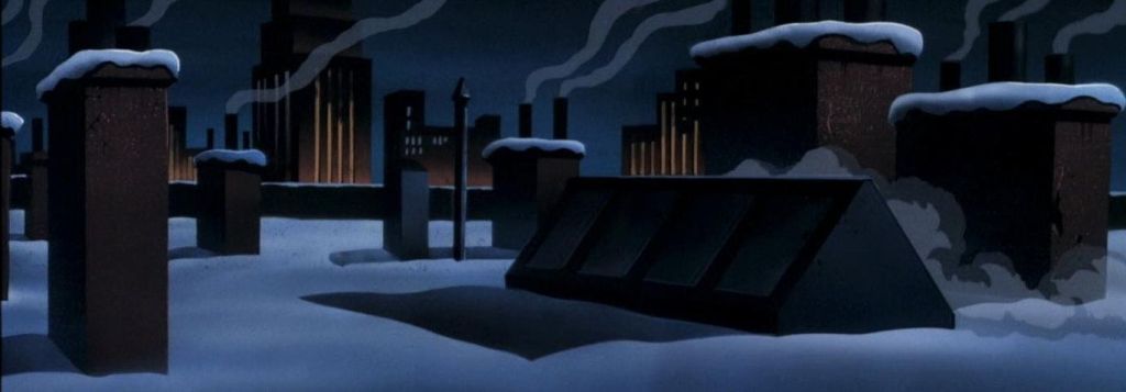
For this project I wanted to take a more traditional approach where we used falt coloured backgrounds. One was I think would be to use the technique used by Batman the animated series team, where they drawed coloured drawings on a black charpaper rather than painting in black. This method in turn gave black a flat matte feel while the coloured imagery a more grainy look.
As a child I have always admired the chuck jones art style. This was also visible during the early cartoon network era when cartoon like Dexter’s laboratory and Powerpuff girls made use of this. Even though there were flat (in the sense that there was as such no perspective and depth). The energy of the charcters used to gel in quite naturally.
I need to find a middle ground between these two styles. and A mixture of Max fliecher and Chuck Jones cartoons where the backgorunds were flat yet the charcters had a gradient feel.
References
Batman the animated series. 1992. [Film] Directed by John Calmette, Bruce Timm. s.l.: s.n.
Pink Panther. 1963. [Film] Directed by Tom O’Loughlin. George DeLado. USA: United Artists.
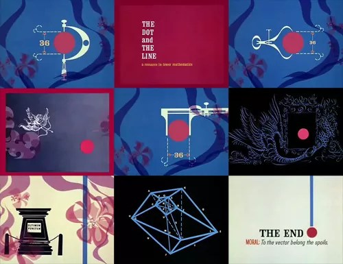
The Line and Dot. 1965. [Film] Directed by Chuck Jones, Don Morgan , Maurice Noble. USA: Chuck Jones.
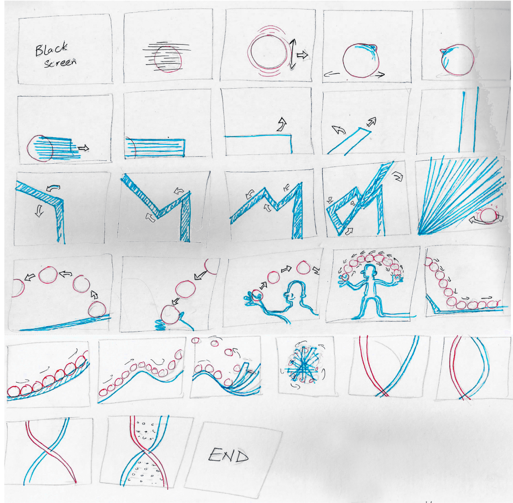
The storyboard is still a work in progress, but I think I have a clear outline of the story and hae locked the basic shots and their framing.
1st 20 frames
As you can see in the storyboard above the story starts when show a red dot roaming around, living a carefree life and starts to feel a bit unwell. the dot goes a bit of haywire and a line burts out from it. The line although at first is seen as a new born, but it quickly breaks the norm and starts to learn more about itself. Learns that it could bend and before you know it goes on a war with the dot.
Most the framing is either long shots, close up or extreme closeups.
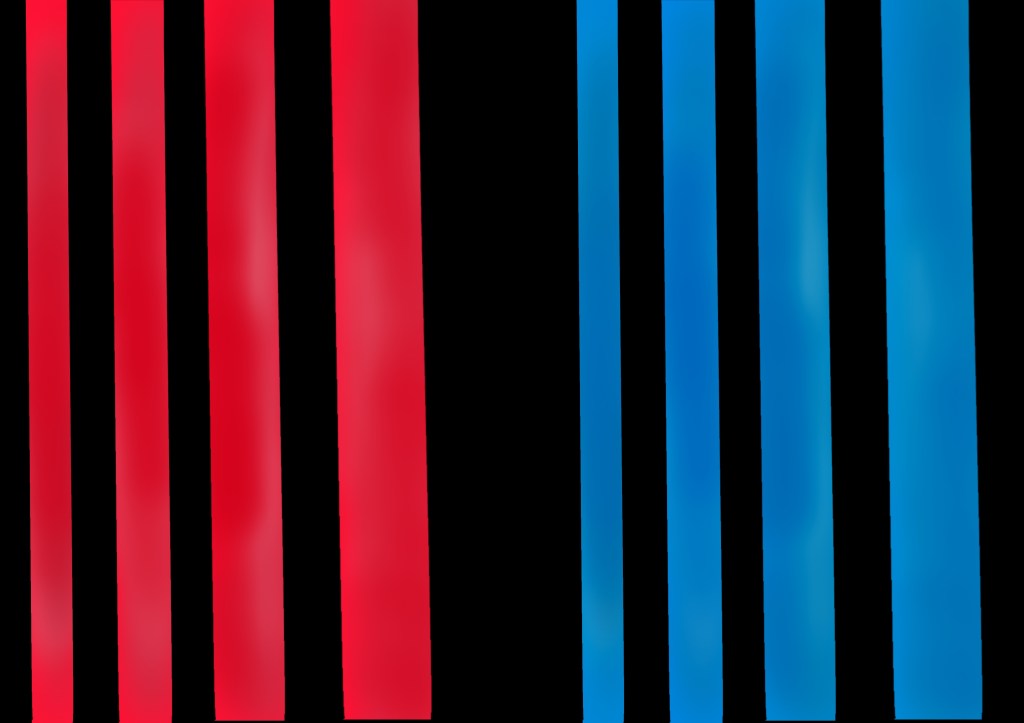
As in the brief it was Red vs Blue, so those are supposed to be the dominating colours. But, this did not meant that there couldn’t be other colours as well. For this animation I am going for an old school vibe. A mixture of Max fliecher and Chuck Jones cartoons where the backgorunds were flat yet the charcters had a gradient feel.
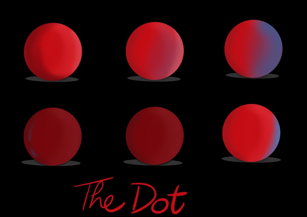
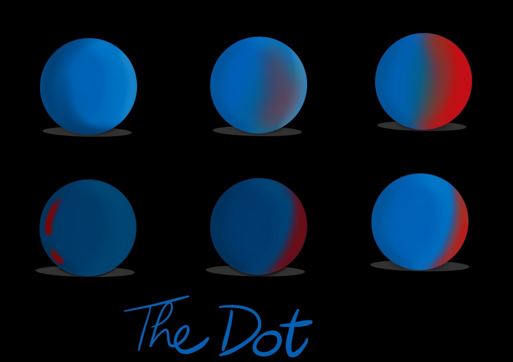
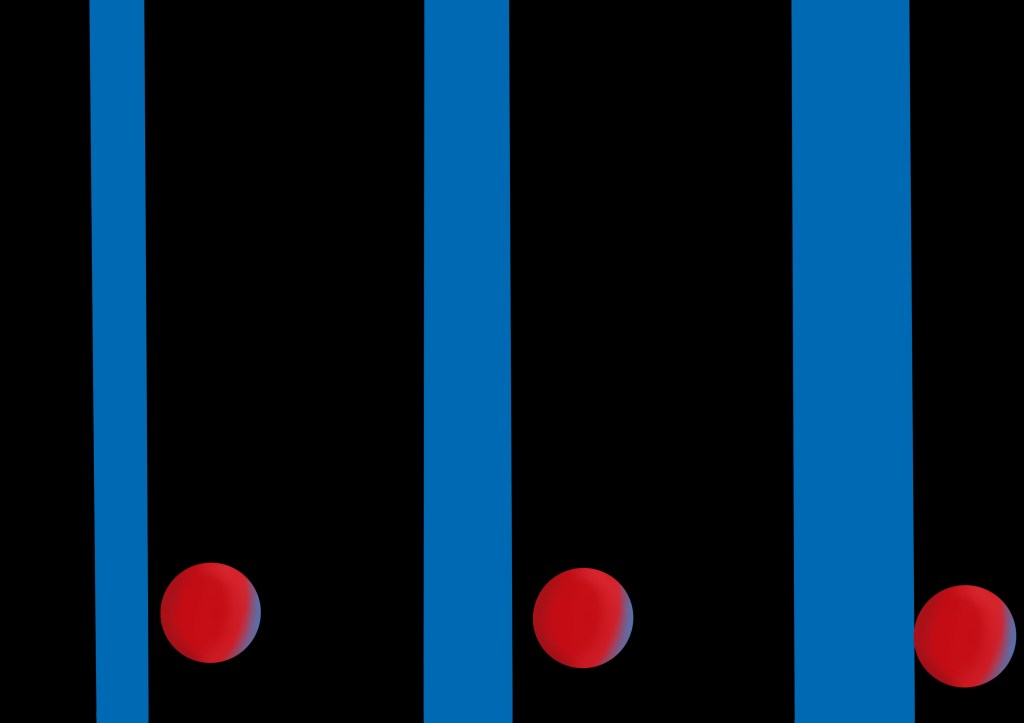
The character of Dot – Since I was to go for either red or blue, I did some ideation in both colours for the dot and line. This was necessary as the chosen colours needed to jusitfy the characters and have reason for them to be in those specific colours (have a purpose).
The dot in redThe dot in blue
I think the colour red better suits the dot as it gives it more of characters. Gives it a warm feel while the blue colour feels a bit more energetic and accordinng to the story is better suited for the line.
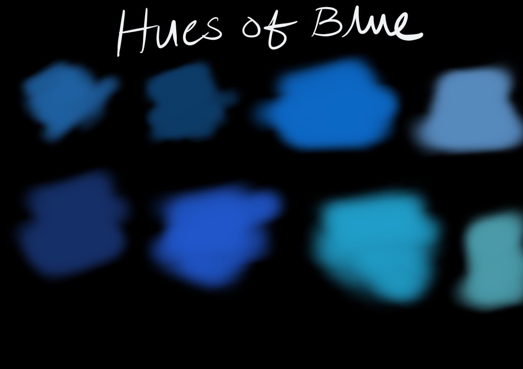
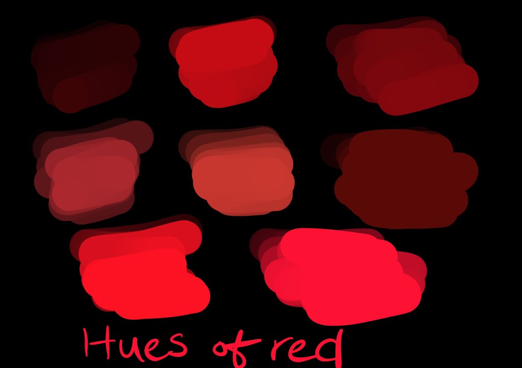
Blue colours that could be usedRed colours that could be usedThe line
In order for me to fully decide on what colours to choose, a side by side comparison was necessary of the both characters. Consider it a suit test for the camera, just like in films.
The line and dot comparison
With all done and dusted I will move on to the next phase, where I will try to work on the background.
An inspiration would be stanely kubrick who would use colours and environments to depict the characters mood and traits e.g. In eyes wide shut blue and not so much red but amber play a key role in highlighting the difference between the cold world out side the couples relationship and the warm safe world they start off in. You can see the blue creep more and more into their home throughout the film and the amber is used to create warm safe havens that can also give way to the blue when truths are revealed and characters reveal their true colours. It’s part of the films powerful psychological narrative, you don’t need to notice it for it to effect the way you feel. In the other of his films you gave examples of there wasn’t that much use of those colours beyond creating contrast and dramatic imagines and using red for danger etc but they certainly had their own colour schemes and meanings. I always felt there was something delicious about giving Alex and his droogies white outfits seeing as white is so often used to connote innocence. I think in a way there was something innocent about them which is another meaning in the film, they were who they were, unlike the society they were in which had its own deceitful, hypocrisy and agenda.
Instead of a more head on approach I think a more symbolic and abstract approach would be the way. I still remeber one of my very basic art lessons where we were asked a question who came first ‘the line or the dot’. Now it’s a chicken and egg kind of debate because one cannot co-exist without the other.
The line and dot are also the basic principles of design. If you were to analyse the natural and man-made environment, you would soon discover that the simplest object is the dot or point. The dot is generally small and uncomplicated in shape. If the dot is extended in its primary dimension of length, the object is known as a line. The linear object may be straight or curved, regular or irregular. However, when a line encloses itself, it has two primary dimensions; length and breadth. The resulting object is known as a planar shape. These shapes can be organic or inorganic or biomorphic. When a plethora of shapes are developed in a third primary direction, it is known as a solid or a more limited form.
In 1965, a similar abstract appraoch was taken by the famous cartoonist Chuck Jones and created The Dot and the Line – A Romance in Lower Mathematics for schools. The short itself won the Academy award for best short film.
Nukta
The Story
The story starts when show a red dot roaming around, living a carefree life and starts to feel a bit unwell. the dot goes a bit of haywire and a line burts out from it. The line although at first is seen as a new born, but it quickly breaks the norm and starts to learn more about itself. Learns that it could bend and before you know it goes on a war with the dot. The line plays around with the dot and eventually they both start to mix and inter twine to become a dna strand and they keep on replicating. This story is basically about life starts and continues.
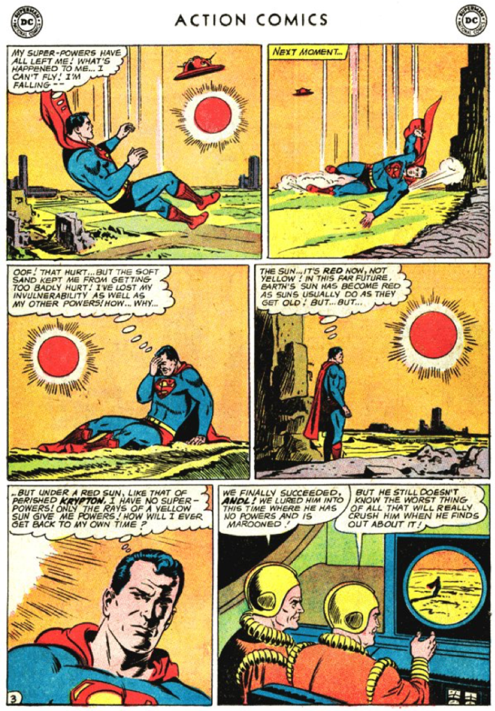
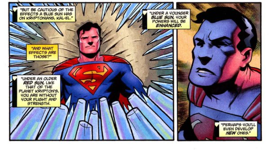
Here the two contrasting colors, red and blue, play the two leading roles, blue as the protagonist and red as the antagonist. Blue here signifies value and support as it makes superman stronger whereas, red portrays destruction and helplessness as superman loses his superpowers under the red sun.
Even his suit is made up of three colors: red, blue and yellow. These colors portray how the different colored suns effect him. Blue is used most widely because of its positive impact, red is the second most used color because of its negative impact on him and yellow is the least used as it has little to no effect on his superpowers.
Blue portrays superman’s calmness and strategic tactic whereas red portrays his dominance and dignity. His planet, Krypton’s sun, which is red in color, displays his connection to the planet and blue displays his connection to Earth.
action comic strip
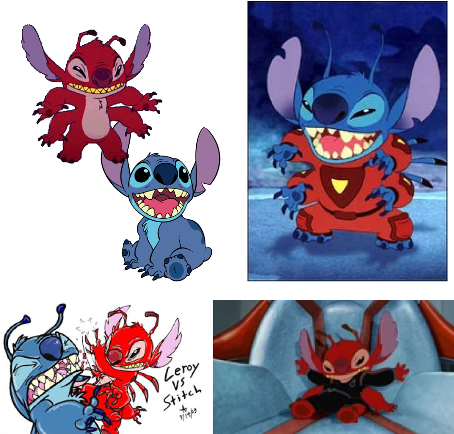
Leroy and Stitch
In “Lilo & Stitch” Stitch is the lead character who is a blue alien and his primary role was to destroy everything and causing chaos in the entire universe. However, his personality changed when he met Lilo. He was still chaotic, aggressive he became kind, sweet and caring towrds everyone. All he needed was a little love and support by his new family.
Whereas, his twin brother Leeroy, a red alien who looks exactly like Stitch is sent to fight him. He is the antagonist. He is seen to be ruthless, destructive with no emotion to be seen. He is considered to just be a destructive machine who is loyal to his creator. Leeroy is mischievous, harmful, aggressive, sadistic and cruel with no morals. Unlike stich he is more mature, merciless, brutal and enjoys torturing others. Leeroy is also strategic, smart and cunning as he uses proper strategies for battle unlike Stitch who acts on impulse. The two contrasting personalities of similarly built characters and their portrayal through different colors used symbolically to portray the protagonist and antagonist is evident in this example.
Leroy and Stitch
Myosis
Red vs. Blue
A short film that touches a topic on different layers i.e. a character’s struggle to not conform to societal expectations as he struggles to hold on to things that he loves. In the film Red and Blue is used to convey two conflicting themes – passion versus dullness. Red and Blue can be interpreted in many ways – using colors to differentiate two different sides; or even evoking feelings by relating the colors to common daily themes. For exxample red to feelings like love, lust and passion; while blue is commonly related to feelings of calm and serenity (while in this case, a muted, grayish blue is used to evoke dread).
The Blue Umbrella
Even if the plot is brief and adorable and doesn’t focus too much on serious subjects, the superb execution nevertheless leaves a lasting effect. Red and blue are used in the short film’s straightforward plot to distinguish between two characters. The film makes creative use of camera angles, the soundtrack, and lighting to subtly express emotions without the use of overt body language or gestures. Of course, the 2D animated facial expressions contribute as well, but that seems more like a creative choice to appeal to a wider audience as the plot could have been told without the 2D images.
The Super Mario Movie
The classic fire vs. ice is used to symbolise the red vs. blue debate.
There were multiple aspects that I had to consider when approaching this topic, e.g. the script, moodboard, lighting, music, characters, the amount of time to do this, the duration of the short (in this case I am limited to 30s). For me, the priority was story telling.
Being a theater performer and direcror, I just had to get a theatrical type eperience idea out of my system. I used my puppetry skill sets to craft a concept inspired by black light performances. A technique where you use UV lights, black cloths and neon paints to do the right.