The above animatic is more of a screen test. The pacing is off, some of the frame rates need to be adjusted but however the colours seems to pop up quite nicely with the background. For, the next version I will revise all of these and I hope turns out quite better.
Red vs. Blue | Experimenataion
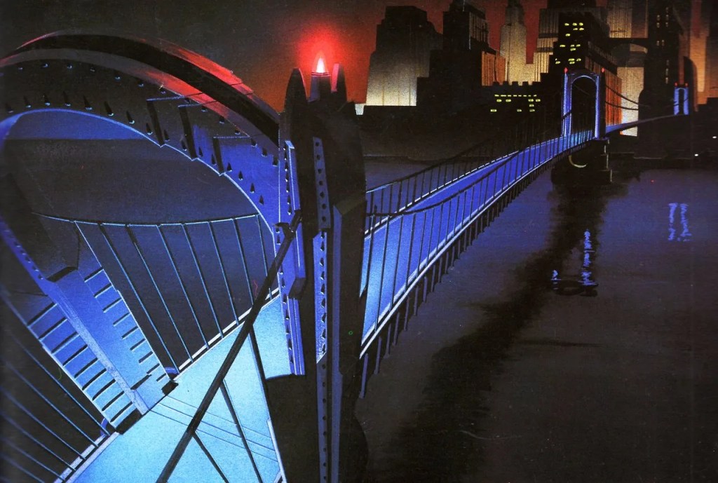
For this project I wanted to take a more traditional approach where we used falt coloured backgrounds. One was I think would be to use the technique used by Batman the animated series team, where they drawed coloured drawings on a black charpaper rather than painting in black. This method in turn gave black a flat matte feel while the coloured imagery a more grainy look.
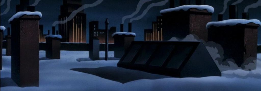
As a child I have always admired the chuck jones art style. This was also visible during the early cartoon network era when cartoon like Dexter’s laboratory and Powerpuff girls made use of this. Even though there were flat (in the sense that there was as such no perspective and depth). The energy of the charcters used to gel in quite naturally.
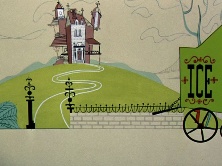
I need to find a middle ground between these two styles. and A mixture of Max fliecher and Chuck Jones cartoons where the backgorunds were flat yet the charcters had a gradient feel.
References
Batman the animated series. 1992. [Film] Directed by John Calmette, Bruce Timm. s.l.: s.n.
Pink Panther. 1963. [Film] Directed by Tom O’Loughlin. George DeLado. USA: United Artists.
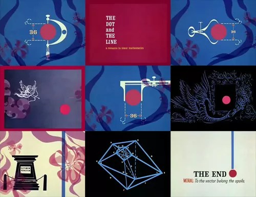
The Line and Dot. 1965. [Film] Directed by Chuck Jones, Don Morgan , Maurice Noble. USA: Chuck Jones.
Decision Making | Storyboard
The storyboard is still a work in progress, but I think I have a clear outline of the story and hae locked the basic shots and their framing.
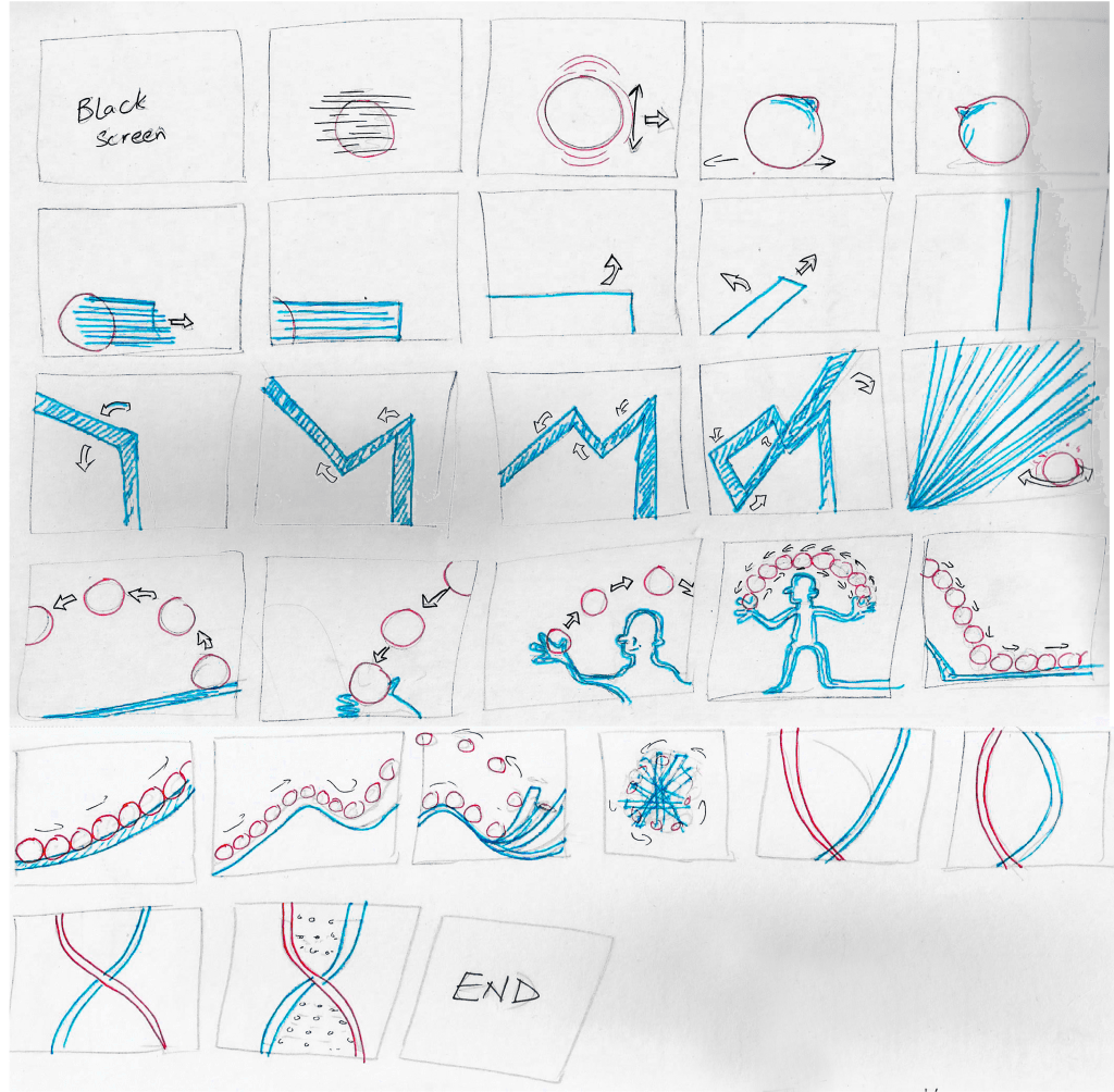
As you can see in the storyboard above the story starts when show a red dot roaming around, living a carefree life and starts to feel a bit unwell. the dot goes a bit of haywire and a line burts out from it. The line although at first is seen as a new born, but it quickly breaks the norm and starts to learn more about itself. Learns that it could bend and before you know it goes on a war with the dot.
Most the framing is either long shots, close up or extreme closeups.
Character Development | Nukta
Concept arts
As in the brief it was Red vs Blue, so those are supposed to be the dominating colours. But, this did not meant that there couldn’t be other colours as well. For this animation I am going for an old school vibe. A mixture of Max fliecher and Chuck Jones cartoons where the backgorunds were flat yet the charcters had a gradient feel.
The character of Dot – Since I was to go for either red or blue, I did some ideation in both colours for the dot and line. This was necessary as the chosen colours needed to jusitfy the characters and have reason for them to be in those specific colours (have a purpose).
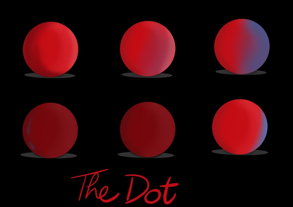
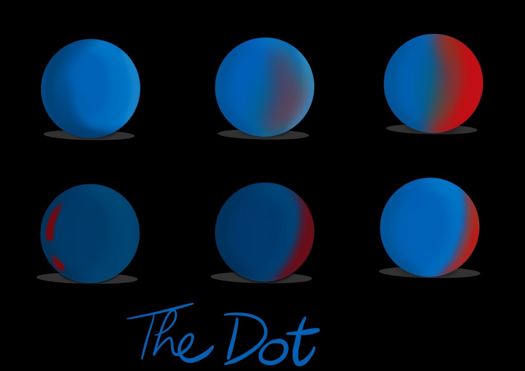
I think the colour red better suits the dot as it gives it more of characters. Gives it a warm feel while the blue colour feels a bit more energetic and accordinng to the story is better suited for the line.

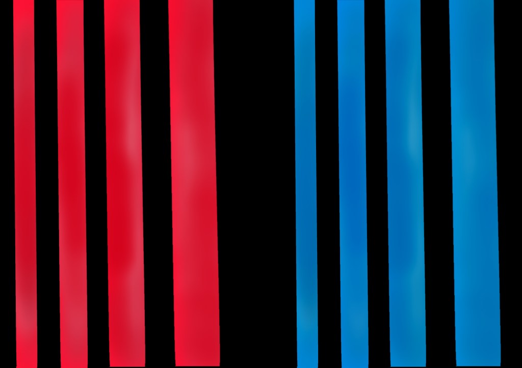
In order for me to fully decide on what colours to choose, a side by side comparison was necessary of the both characters. Consider it a suit test for the camera, just like in films.
With all done and dusted I will move on to the next phase, where I will try to work on the background.
Decision Making and Experimentation | Concept#2
An inspiration would be stanely kubrick who would use colours and environments to depict the characters mood and traits e.g. In eyes wide shut blue and not so much red but amber play a key role in highlighting the difference between the cold world out side the couples relationship and the warm safe world they start off in. You can see the blue creep more and more into their home throughout the film and the amber is used to create warm safe havens that can also give way to the blue when truths are revealed and characters reveal their true colours. It’s part of the films powerful psychological narrative, you don’t need to notice it for it to effect the way you feel. In the other of his films you gave examples of there wasn’t that much use of those colours beyond creating contrast and dramatic imagines and using red for danger etc but they certainly had their own colour schemes and meanings. I always felt there was something delicious about giving Alex and his droogies white outfits seeing as white is so often used to connote innocence. I think in a way there was something innocent about them which is another meaning in the film, they were who they were, unlike the society they were in which had its own deceitful, hypocrisy and agenda.
Instead of a more head on approach I think a more symbolic and abstract approach would be the way. I still remeber one of my very basic art lessons where we were asked a question who came first ‘the line or the dot’. Now it’s a chicken and egg kind of debate because one cannot co-exist without the other.
The line and dot are also the basic principles of design. If you were to analyse the natural and man-made environment, you would soon discover that the simplest object is the dot or point. The dot is generally small and uncomplicated in shape. If the dot is extended in its primary dimension of length, the object is known as a line. The linear object may be straight or curved, regular or irregular. However, when a line encloses itself, it has two primary dimensions; length and breadth. The resulting object is known as a planar shape. These shapes can be organic or inorganic or biomorphic. When a plethora of shapes are developed in a third primary direction, it is known as a solid or a more limited form.
In 1965, a similar abstract appraoch was taken by the famous cartoonist Chuck Jones and created The Dot and the Line – A Romance in Lower Mathematics for schools. The short itself won the Academy award for best short film.
Nukta
The Story
The story starts when show a red dot roaming around, living a carefree life and starts to feel a bit unwell. the dot goes a bit of haywire and a line burts out from it. The line although at first is seen as a new born, but it quickly breaks the norm and starts to learn more about itself. Learns that it could bend and before you know it goes on a war with the dot. The line plays around with the dot and eventually they both start to mix and inter twine to become a dna strand and they keep on replicating. This story is basically about life starts and continues.
Reflection on the Red vs. Blue concept use in media
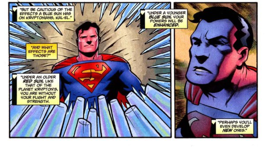
Superman
Here the two contrasting colors, red and blue, play the two leading roles, blue as the protagonist and red as the antagonist. Blue here signifies value and support as it makes superman stronger whereas, red portrays destruction and helplessness as superman loses his superpowers under the red sun.
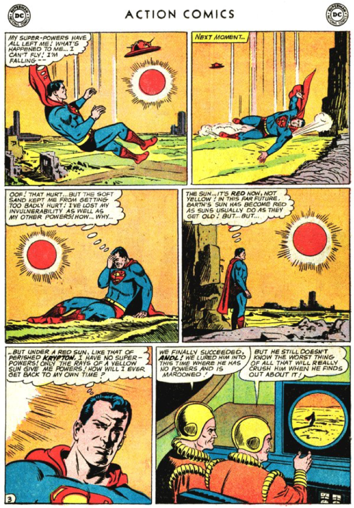
Even his suit is made up of three colors: red, blue and yellow. These colors portray how the different colored suns effect him. Blue is used most widely because of its positive impact, red is the second most used color because of its negative impact on him and yellow is the least used as it has little to no effect on his superpowers.
Blue portrays superman’s calmness and strategic tactic whereas red portrays his dominance and dignity. His planet, Krypton’s sun, which is red in color, displays his connection to the planet and blue displays his connection to Earth.
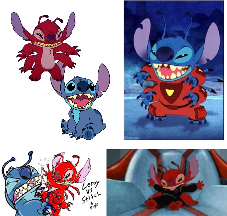
Leroy and Stitch
In “Lilo & Stitch” Stitch is the lead character who is a blue alien and his primary role was to destroy everything and causing chaos in the entire universe. However, his personality changed when he met Lilo. He was still chaotic, aggressive he became kind, sweet and caring towrds everyone. All he needed was a little love and support by his new family.
Whereas, his twin brother Leeroy, a red alien who looks exactly like Stitch is sent to fight him. He is the antagonist. He is seen to be ruthless, destructive with no emotion to be seen. He is considered to just be a destructive machine who is loyal to his creator. Leeroy is mischievous, harmful, aggressive, sadistic and cruel with no morals. Unlike stich he is more mature, merciless, brutal and enjoys torturing others. Leeroy is also strategic, smart and cunning as he uses proper strategies for battle unlike Stitch who acts on impulse. The two contrasting personalities of similarly built characters and their portrayal through different colors used symbolically to portray the protagonist and antagonist is evident in this example.
Myosis
A short film that touches a topic on different layers i.e. a character’s struggle to not conform to societal expectations as he struggles to hold on to things that he loves. In the film Red and Blue is used to convey two conflicting themes – passion versus dullness. Red and Blue can be interpreted in many ways – using colors to differentiate two different sides; or even evoking feelings by relating the colors to common daily themes. For exxample red to feelings like love, lust and passion; while blue is commonly related to feelings of calm and serenity (while in this case, a muted, grayish blue is used to evoke dread).
The Blue Umbrella
Even if the plot is brief and adorable and doesn’t focus too much on serious subjects, the superb execution nevertheless leaves a lasting effect.
Red and blue are used in the short film’s straightforward plot to distinguish between two characters.
The film makes creative use of camera angles, the soundtrack, and lighting to subtly express emotions without the use of overt body language or gestures.
Of course, the 2D animated facial expressions contribute as well, but that seems more like a creative choice to appeal to a wider audience as the plot could have been told without the 2D images.
The Super Mario Movie
The classic fire vs. ice is used to symbolise the red vs. blue debate.
References
Myosis. 2013. [Film] Directed by Ricky Cometa, Guillaume Dousse, Adrien Gromelle, Thibaud Petitpas Emmanuel Asquier-Brassart. France: Gobelins.
Siegel , J. & Shuster, J., 1938. Superman. s.l.:DC comic.
The Blue Umbrella. 2013. [Film] Directed by Saschka Unseld. s.l.: Pixar.
The Super Mario Bros. Movie. 2023. [Film] Directed by Michael Jelenic aron Horvath. s.l.: Universal Studios.
Leroy and Stitch. 2006. [Film] Directed by Bobs Gannaway, Tony Craig. s.l.: Disney.
Concept#1 | Research
There were multiple aspects that I had to consider when approaching this topic, e.g. the script, moodboard, lighting, music, characters, the amount of time to do this, the duration of the short (in this case I am limited to 30s). For me, the priority was story telling.
Being a theater performer and direcror, I just had to get a theatrical type eperience idea out of my system. I used my puppetry skill sets to craft a concept inspired by black light performances. A technique where you use UV lights, black cloths and neon paints to do the right.
Some examples are as follows;
References
Blacklight Routine. 2010. [Film] Directed by BMHS Teacher Talent Show. s.l.: s.n.
Black-Light Theatre. 2016. [Film] Directed by Lucie Bojasova. s.l.: s.n.
UDI Blacklight Dance Group. 2018. [Film] Directed by America Got Talent. s.l.: s.n.
UDI Dance. 2018. [Film] Directed by Americas Got Talent. s.l.: s.n.
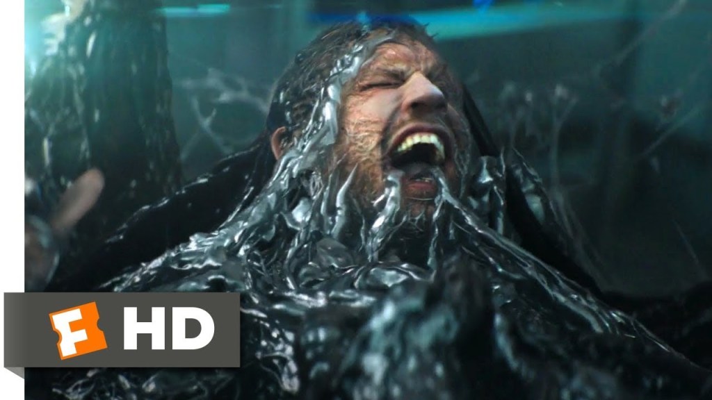
Venom. 2018. [Film] Directed by Ruben Fleischer. s.l.: s.n.
Concept#1 | Creative Development & Experimentation
Chakra
The concept was fairly simple. It was inspired the ideology of seven deadly sins with a little touch of Ying and Yang concpet or Chakra so to speak. The whole 30 second animation would play out like a theatrical performance and where little object would transform into other things depending on the scene.
The story
It starts of with a black screen, and a blue light starts to illuminate and appears little stars that transform into little birds ( a nod to how the universe was created), then appears a blue figure (the protagonist). He starts to admire the world created arounnd him. He comes across a tree that has different fuits growing in it. As he is about to touch omnius music starts to play and a red light starts to burst out of the blue figure. He is split into two now a red and a blue one. Whatever the red touches, turns into dust. A face-off takes between the two and blue is deafted. His soul is about to fly away, just when a scared flock of birds start to pull him down. He realises that people need him and the soul flies back in to the body. We cut to the red figure (the antagonist) recking havoc. It’s a red vs. blue showdown and they run towards each other. Both clash into each other and dissipate into thin air leaving luminus dust behind, That gives birth to a whole civilization.
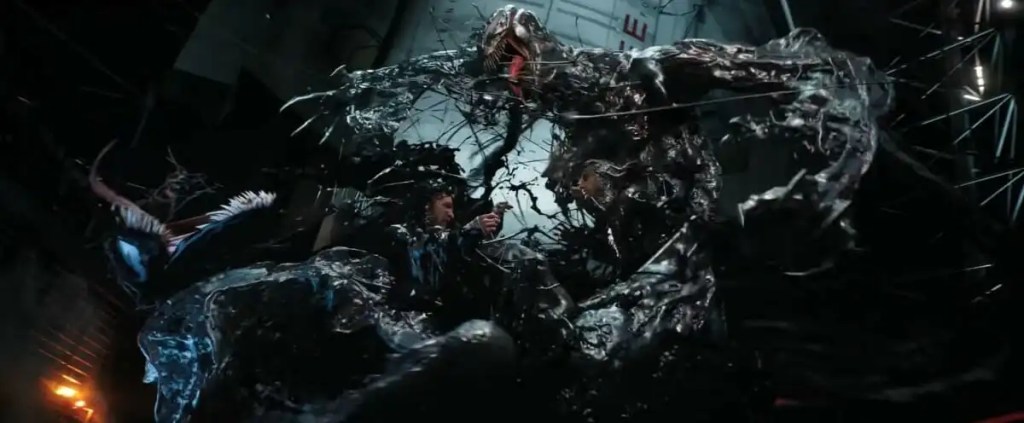
The fight choreography is inspired by the fight between Venom and Riot.
The said idea, will work better as a theatrical performance rather than an animation as such proposed gimicks are better off on stage rather than the screen. Maybe the next couple ideas could be more in line.
A rough concept art of the characters;

The characters are inspired from blacklight performances, as they have a jumper suit. The reason in blacklight performaces is because of technical issues but for the story point of view this way the charcters remain anonymous and could create a more relatibility factor.
Red vs. Blue – Research and Ideation
There is no refuting that this assignment will challenge my story telling skills, so have to go beyond them. For me creativity is not thinnking outside the box. I believe that creativity burts out when you are limited, constrained to a certain limit. I knew it from the start that there has to be more symbloic ways to show red vs. blue. Lets just get the generic ideas out first.
The phrase red vs. blue instanty gives a vibe of conflict, the most common examples are when two similar characters are used, who have the same traits but are just the polar opposites of each other.
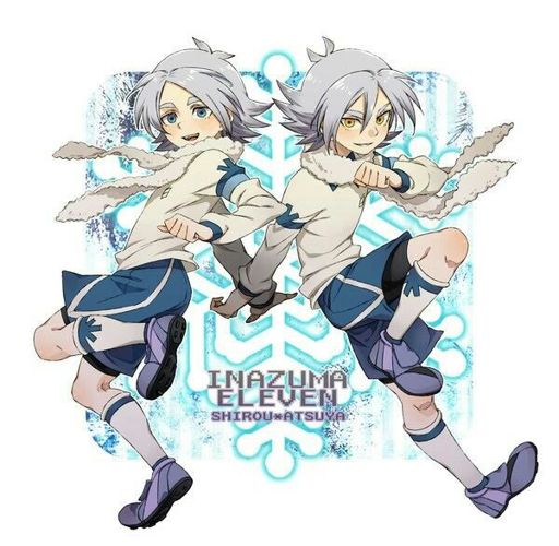
Shawn Frost- Inazuma Eleven
In this example, we see the that the character suffers from a dual personality disorder. When his brother passed away Shawn Frost adopted his personality.
This drastic change in his personality can be seen when his eyes change from blue to red, where blue portrays Shawn as a calm, depressed, shy boy who plays football at defense and red portrays Shawn as his twin brother’s personality who is aggressive, arrogant, playful, cheeky, mischievous and plays football at offense. Just like the colors blue and red, both of his personalities contrast one another.

Uzumaki clan and the Uchiha clan- Naruto
The uzumakis are considered to be healers through their immense chakras. Its members are renowned for having bright, red hair, possessing incredibly strong life-forces and chakra, and their sealing prowess. They are also considered to be extremely passionate, loving and caring of others. Red is the signature color of the Uzumaki clan in Asian culture red is an important color symbolizing prosperity and a long life which the Uzumaki clan is renowned for.
The Uchihas have black hair with blue tint. They are strong, clever, strategic and arrogant. Uchihas are subject to powerful emotions: these emotions typically start as love for a friend or family member that then become overpowering hatred when the object of their love is lost and they gain power from these emotions. The clan grew isolated and began plotting a coup d’état to overthrow the leader of the village and his administration. This shows how selfish and disloyal they were.

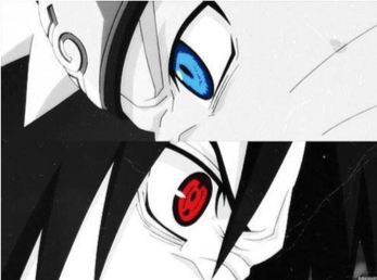
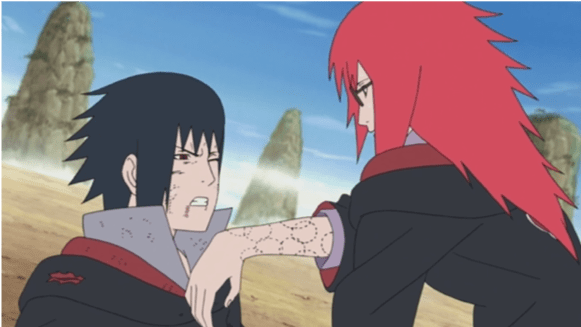
Karin Uzumaki (Red) was in love with Sasuke Uchiha (Blue) and despite knowing about her unrequited love, he used her to regain his powers. Whenever he ran out of chakra he would bite her arm to take some of her chakra and heal himself. Despite being a tough, smart and independent woman Karin’s passion and selfless (red) love for Sasuke made her weak who was just selfishly (Blue) using her.
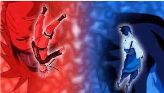
Naruto Uzumaki, the protagonist of the show, has a rivalry with sasuke Uchiha. The two have completely different personalities and this is symbolically portrayed through the contrasting colors and shades of red/yellow/ orange and Blue/purple/grey.
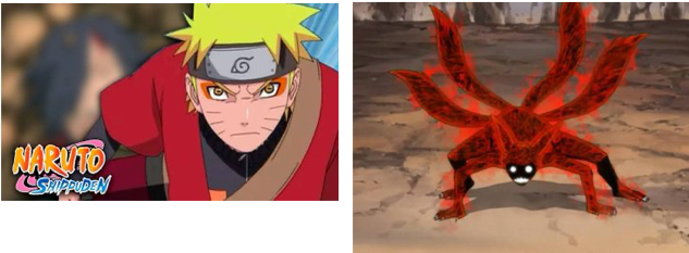
Naruto: he uses warm colors such as yellow, orange and red, it is the representation of the sun and yang. In Japan these colors mean: -Yellow: sun, light, heat, knowledge and fear –Orange: eternity, happiness, protection, kindness, envy and resentment. there is a transition from the less use of red in “Naruto” to a more use red in “Naruto Shippuden” which portrays character development and maturity of the character as he grows older. It also portrays motivations, responsibility, weaknesses and loss.
Sasuke: cold colors such as blue and purple,sometimes with gray undertones and Its the representation of the moon and the ying. In Japan colors have these meanings- Blue:Hope,respect,remoteness and coldness -Purple:honor, recognition, wisdom,knowledge,suffering and death
This is also consistent with the character’s personality, ailments and goals, including the transition from blue to purple resentment from “Naruto” to “Naruto Shippuden” representing the quest for knowledge, loss and despair

However, both of these characters share somepersonality traits which is pottrayed in their eye colours. Here, Sasuke Uchiha’s eyes are red (representing the Uzumaki clan/ their hair color) and Naruto Uzumaki’s eyes are Blue (representing the Uchiha clans/ their hair color)
Another example would be of Dexter’s Laboratory, where the most common trope is they have distingushed the male and female characters in blue and pink ( the generic way of distingishing two genders).
Dexter’s Lab is showcased in hues of blue. While Dee dee’s room is shown in hues of pink. The rival however Mandark is highlighted in Red.


References
Dexter’s Laboratory. 1998. [Film] Directed by Genndy Tartakovsky. USA: Hannna Barbera Cartoon.
Inazuma Eleven (TV series). 2008 – 2011. [Film] Directed by Katsuhito Akiyama. s.l.: OLM, Inc..
Naruto Shippuden. 2007-2017. [Film] Directed by Hayato Date. Japan: Pierrot Co., Ltd..
Project #1 | Red vs Blue
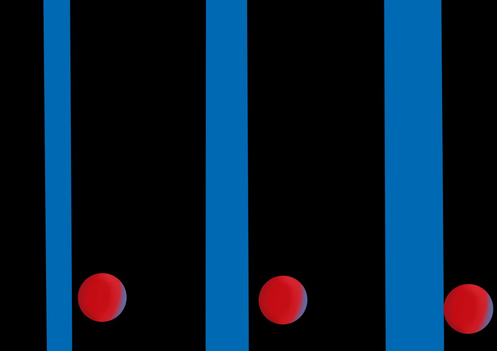
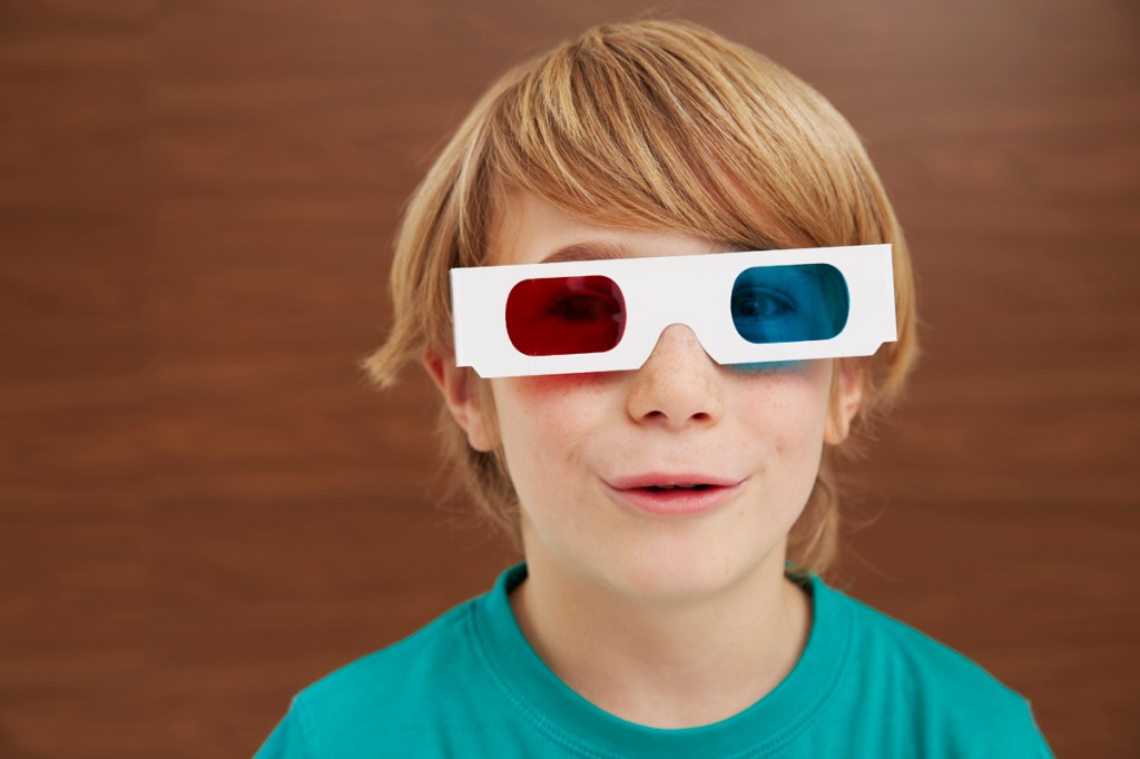
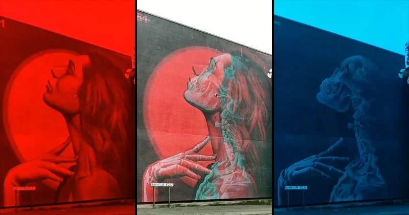
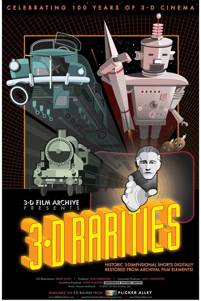
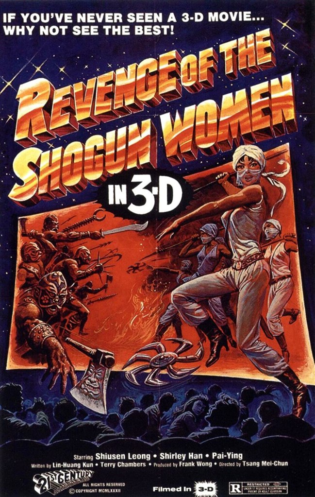
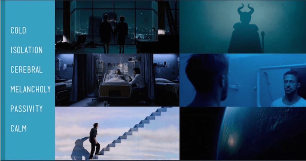
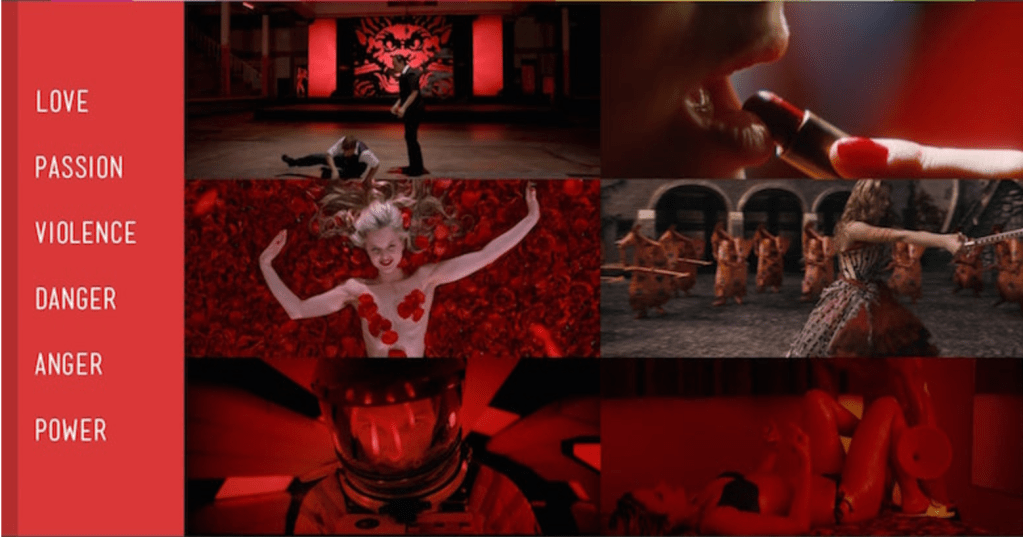
Whenever you hear the word Red vs Blue, your mind automatically comes to conclusion that it must refer to a conflict. I think it is more than that. Red and Blue are the two most common colours of the spectrum. As being complementary colours, together they create a sense of harmony. Lets take a look through the eyes of a colour spectrum e.g. red is often associated with strong emotions like power, passion and energy, using too much can overwhelm the space. Blue on the other hand calls to mind feelings of calmness or serenity. It is often described as peaceful, tranquil, secure, and orderly. Blue is often seen as a sign of stability and reliability. Businesses that want to project an image of security often utilize blue in their advertising and marketing efforts. This is not limited to nature but the concept of Red vs. Blue bouncing of each other dates as back as to the first 3d films ever made i.e. anaglyph 3d. The two complementary colours when inter-twined toghther created mind boggling imagery.
A fews of the examples are;


If you’re looking for a subtle way to make a scene resonate emotionally, there may be no better way than choosing a color associated with the emotion you are trying to evoke. e.g.
The assignment is very self explanatory ‘Red vs. Blue’. In this 2 week long assignment we are supposed to come up with ideas that fit the ideology of Red vs. Blue. In the next couple of blogs I will cover my research work, concepts, ideations, storyboards and animatics.
References
Insane51, 2020. Anaglyph Street Art. [Art].
Anon., n.d. Digital Synopsis. [Online]
Available at: https://digitalsynopsis.com/design/film-movies-color-psychology/
